

Vinnart
-
Posts
2,570 -
Joined
-
Last visited
-
Days Won
4
Posts posted by Vinnart
-
-
Absolutely interested! I see a day when CM offers 3v3 + 1 observer slot per side for real time play. When this happens I will be so on board. Sudden Strike 2 is a good model to follow for success for this multiplayer genre. A lobby would definitely be needed for joining, and finding posted games. When CM goes this route you will see the real time element of this game EXPLODE in popularity! For those not familiar with this type of play it is the most fun you will have gaming. The teamwork makes for good camaraderie, and if you play on an organized team with voice comms as I did it adds so much to the experience. The observer slot per side is also a must to do it right. The observer can just watch the game, use it for training, or can be a designated supreme commander to coordinate the team. I’ll have to do a mock up to show how Sudden Strike dealt with this element for those not familiar with it which made it extremely popular. Some of these type games were so much fun I can recall games I had 10 yrs ago. Nothing as satisfying as breaking through the line to play a major part in your team winning, or demoralizing the guy across from you so much that they quit. Ah, those were the days. Grogs this is the type of play that will really show your meddle.
This would be pretty much RT play as WEGO just does not lend itself to CO – OP. It is hard enough to get one person to send turns in a timely manner, so I doubt more than 1v1 is practical for WEGO. Real Time is where Co-Op
-
If capturing the objective/VP location is part of the game, and what you must do to win I don’t have a problem with it. Do you mean to say when you guys play a single player game you do not try to capture the objective if there is 1 turn left? I say if your opponent gets the VP it is not his fault, but YOUR own from preventing it from happening. I have had people try to do a last minute rush only to be destroyed because he did not prepare the attack properly, and I was ready for it. Just play the game, and have fun I say. The only rule that I think is universal is no targeting artillery on the set up turn, unless one is the attacker in an Attack/defend. This is because it ruins the game before it even starts. Anything else an opponent wants to try then bring it on! Pull it off then shame on ME.
-
I think CM has the best camera I have used to date. No game I have ever played has offered as much control, and available views. The camera is often a game breaker decision for me in whether I will get a game or not. When CMSF first came out I would not get it till they fixed the preset camera views. Once they did I got it. The CM camera, and control in general are different than the way most RTS games I have played so it takes some getting used to when one starts playing it, but after awhile it feels very right, and comfortable. I wouldn’t change it.
-
F12 is SO great! Definitly has a place on my Nostromo speedpad. I recommend one to everyone along with a mouse with lots of buttons. With these you can navigate this game like a champ.
-
I have never had to worry about it yet because they usually have few units left to rush with. Here at camp Vinbo we take pride it high body count
 . Rushing an assault will not work in a game like CM as it would in a gamey RT type game. The last guy I recall who tried to rush in on a objective with his "super panther" got a bazooka round up his ass. There is time for speed, and there is a time for patience.
 -
If this were included I would want it as an extra option. I DEFINITLY would not want to see the free form mix option go away as I prefer to pick it as I want. I find I make much better forces than the AI can put together. I would be in favor of two types of mixed battle force options:
Mixed (what we have now with NO type limit)
Mixed – Fixed (Cmx1 style with limits per category)
-
Steve, no need to add the text to the portraits I already have it showing up in the game. Now I just need the portraits to swap out to the one without the text when the condition doesn’t apply so my tank commander portrait doesn’t say, “Open” all the time.
 Till then I guess I’ll just have “Vin’s imagined portrait text mod” to hold me over till 3.0.
 -
Yeah, but what you don't understand is that both of these have been on the drawing board since 2006 or so v2.0 already.
Steve
Well, you see great minds think a like
. Trust me I know my limitations in understanding the technical aspects, and in no means want to come across with intent of micromanaging the design. As I said it is just my way of communicating what I’d like in a general way with visual feedback. vs. just trying to explain it with words alone. Thanks for all yours, and the Battlefront team’s hard work in making the best war game I have played to date. I look forward to trying 2.0, and hope my feedback useful in expressing desires for future improvements. Best of luck to you, and the BF team. -
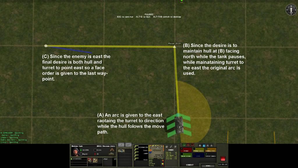
EXAMPLE #4:
-
Example #3, and #4 accomplish the same thing. Which do think was quicker to plot? Which is more visually pleasing?
EXAMPLE #3:
-
EXAMPLE #2:
-
Here are some examples. You will note that example #1, and #2 would accomplish the same thing if a stop along the movement path was not wanted with fewer mouse clicks.
EXAMPLE #1:
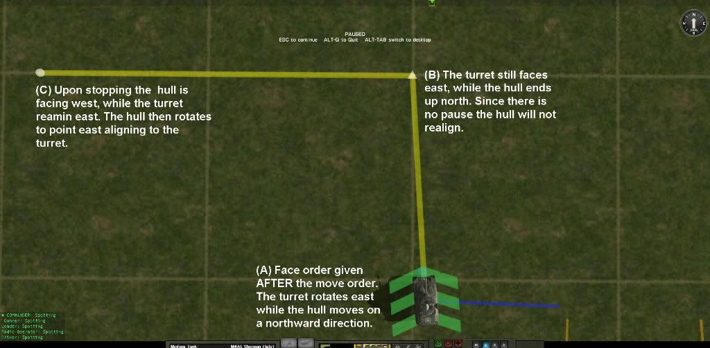
-
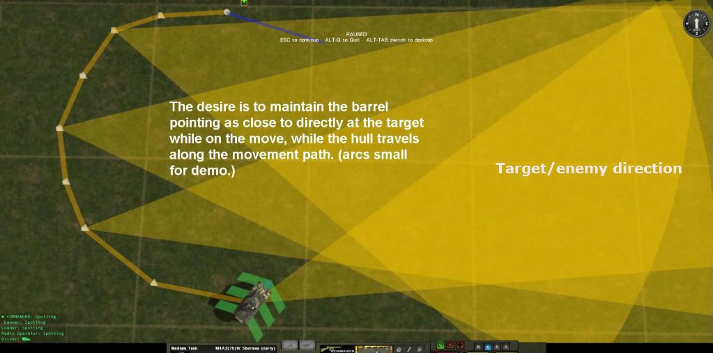
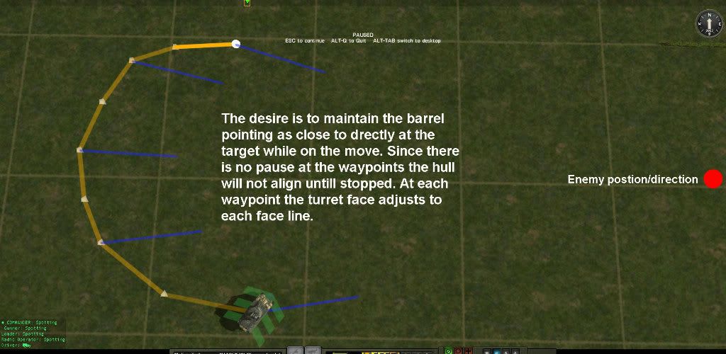
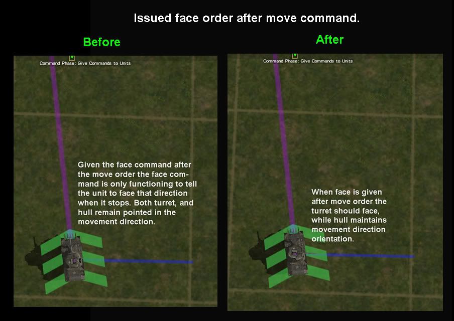
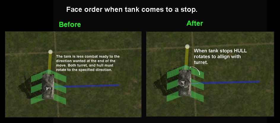
The next improves the player’s ability to control turret direction while the tank is moving. 99% of the time I make an arc for armor it is simply to get the turret to point to a direction without concern for depth. What I am showing here does not take away, but only adds streamlining in player control. Again, perhaps something to consider for practical reasons for future incoppration. Arcs will still be needed, but not as often.
Benefits:
1. Turret arrives at stopping point with it already oriented toward the enemy making it more combat ready. Tank is not as confined by an arc to threats outside the arc, while the turret is facing in a more combat ready posture toward the enemy.
2. Quicker, easier control over turret pointing, especially for real-time, while the tank is moving.
3. This only adds, and takes nothing away which gives the player more options.
4. More visually appealing when arcs are not needed.
-
Like many of you I am anxious to try out the new control features in CMIF with the recent additions of the adjustable waypoints, and the target briefly command. These are definitely good steps in the right direction in improving this already fine product.
I hated to see the following ideas for improving control over the units get lost in other threads that I have posted them in so I am making this thread so they be seen more easily. I think these to be practical feature request for streamlining control, and I hope they are considered for the future.
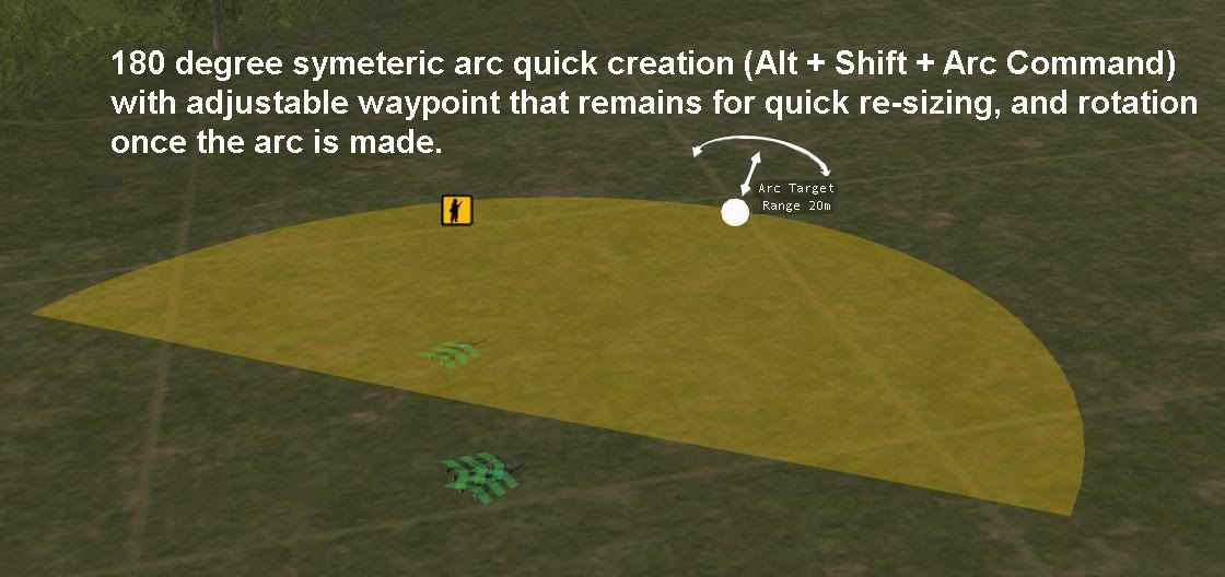
Here is the first thought - QUICK 180-DEGREE ARC CREATION:
Of all the arc controls I found this the one I most often used in CMx1in its convenience. It creates a nice wide arc with symmetric depth control quickly with one mouse click instead of two. The adjustable waypoint I show was not in CMx1, but is a cherry on top for more ultimate control. In this way an existing arc can be changed in depth and direction without having to recreate the arc to change this. Theoretically a person could go through an entire game by just making a single arc. Don’t know if that aspect is possible, but perhaps the quick 180 as in Cmx1 can be included in future feature upgrades. I do not know if even the shift key can be used with the Alt key, but that is for Battlefront to figure out. I only know what I would like to see in function.
-
If anyone is interested in seeing my artwork here is a link: www.vincentmonaco.com Hey can’t resist the chance to give myself a plug
-
The best way to help us design better games is to tell us what information you want to see and not try to design the game yourselves. It's not a good use of time or energy. I say that because in the last 12 years I can't count how many feature requests from you guys that we've implemented. However, I can probably count on one hand how many micro-managed suggestions we've implemented. Though I would have to start by remembering at least one. None come to mind, though I'm sure there are some.
Give us feedback, we give you solutions. Best recipe in the book.
Steve
I have a pretty good track record here for giving useful feedback in support of good practical ways of improving the game mostly dealing with situational awareness, and unit control. Things like window dressings like extra units I never concern myself with beyond just a comment here, and there, because I do not find them priority.
Some of these good practical ways of improving the game mostly dealing with situational awareness have found their way into the game just because they were good, and logical inclusions to address problems no matter who first gives feedback on it. What I have found is Battlefront looks at the practical request, and incorporates it in a different, and often better way. Here is just one example:
The desire was to have better situational awareness for casualties, and panicked units. I am sure I just threw a quick graphic up to show roughly the idea with having a red marker appear as seen in many other games. They incorporated it with the rapid flicker, and the fade, which was better.
Here are a few others that come to mind I have been in included on being in favor of that are now in the game that we see are good, smart improvements:
*More distinct unit icons.
*FoW icons.
Some like the animated text concept to improve the soldier stat text so one can make sense of it better I was able to do on my own through modding. Marco really deserves credit here in making the concept the best. If they like that concept, and want it outside of modding it is there’s to have. I say that because it is a good improvement, and because of the compatibility issues that have occurred differently than with other mods. I do understand there is a fail safe in the works to prevent further problems with mod incompatibilities, which is good. My only desire is that it can still be available compatibility wise In the future at the very least as a mod. I know i would not want to play without it, and know others feel the same way.
When I present what I want to convey to the develops in graphics it is just my way of how I express myself with feedback, and am never insisting that the way I show it is exactly how it should be done. It is just to show it visually in a rough way most of the time, plus it gives me chance to play with photoshop for a little creative fun, and to get more experience with the program. The creative buzz is the same as when I paint, or draw my fine art. It is fun for me, and I really do it for me first, but feel it more useful to share. I am a professional accomplished designer, inventor, and creative artist with an experienced trained eye for visual communication so in this regard I bring some validity in observations. I am also an experienced real time player in understanding that arena in how it differs with WEGO style play. All creative designers benefit from critique as it is through that that often the best designs are realized. This goes for me as well as everyone who designs. Rarely no matter the experience level does one get it perfect right from the start. Development is always a process no matter the product. I try to explain that to people here when they go off on tirades about something that may not be perfect with the game.
I just want to put this last one up as it is the best improvement even though it be hypothetical. Again I am not insisting here, just showing how sensitive the eye is in picking out minor changes. If compared to the first one I through up where Steve said it was hard to read, and cramped feeling you will feel, and see a difference. He was right in that it did not look as good as it could. Like "Pinned" the text is only there when it applies otherwise the box remains empty. If one compares the first, and this next to each other you will see how criticism in deficiencies is improved by:
*Improving placement for context.
*Increasing negative space to max (just below the chin), for easier readability, and less cramping. This could be even better improved by adding more negative space around the head by making it a bit smaller.
*Changed background to black from dark grey for maximum contrast to increase readability.
Like I said, in regard to the GUI I think it is very good overall as is in giving the most essential information needed, but only needs a few of the things I have mentioned in regard to necessary information the player needs for the reasons I have given. Finding ways to improve how that same needed information that is there now is conveyed is always good like the new design for the special equipment. Same information, but given in a more concise, and clear way while not taking anything good away.
-
Steve, one thing I'd like to see in the game is tooltip text for the rank insignia. It's the one remaining bit of information in the GUI that would benefit from having this feature.
What I did, and suggest to you, to learn the ranks of foreign armies just go to the PDF manual and print the page that explains them. Before long you will see you will learn them, and will no longer need the cheat sheet.
-
LOL look out man the anti tank rocking bde is gonna be burning you in effigy next.

Yeah I don’t need those guys chiming in to get us all off topic
. I guess the point I am making is I am more interested in, and find priority in matters that perfect the steering wheel rather than worrying about the hot paint job. If your steering went out in the car I doubt worrying about the window dressing would be a priority at that point. I hear you though. Fortunately that discussion has already happened, and to get into those concerns here would be out of context as to what is being discussed here steering wise. CM steers well, but I think some of the things I am mentioning here adds the final touches to improve how well it steers from my user experience so far. -
I just want sharks with FRICKEN laser beams! Oh Yeah and an evil volcano base of operations that has a self destruct button and escape pods that I can use when my PBEM opponent has gotten the upper hand.
or
A division of plasma rifle(like the ones in fallout) pixeltruppen so I can make my enemies melt into a gooey mess.
and... never mind I think you all are doing a fantastic job. Is it August yet?
I know your busting balls, But what I talk about here are core important situational awareness aspects that I think complete in many ways to challenges that all players face. Lets please keep this conversation about sensible thoughts, between adults. Most of the post I talk about here are geared toward the sensible in a constructive feedback manor from an experienced user’s perspective. I never ask for stupid stuff like this out of context, or waist time worrying about trivial things like a missing unit here, or 1,000 post thread on petty stuff like worry a tank rocks a bit when it shoots. This thread is about constructive feedback.
-
FOURTH:
This has been shown here before, and I recall Steve thought it a good idea, but not possible for some coding reason. Hopefully in the future it can be made possible. Currently the player must reorintate the camera, and zoom in to find out what weapon is down by viewing the model. To eliminate this the downed weapon goes red/dark red, and remains in the UI until buddy aid is finished, then it disappears. This improves situational awareness, and streamline camera management time.
Other than that I wouldn’t make any radical changes, and would call this bottom part GUI high, and tight. Beyond that, the right facing the weapons improves accommodating the text, and the animated text mod is superior in function of processing the info at a glance, and is more interesting over the text only for the soldier stat text alone.
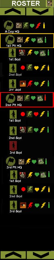
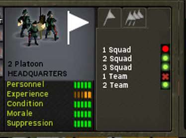
That’s it for the GUI for the most part as my feedback goes from using it since CM came out. I am speaking solely of the GUI as I think there are a few command, and control features that would improve, and streamline control .The ROSTER unit management tool, or something very similar is the only other tool needed to complete, and solve any other remaining situational awareness challenges the real time HvH player faces not only in this game, but in EVERY real time game. To learn more about the ROSTER concept, and to see the development please check out this thread: http://www.battlefront.com/community/showthread.php?t=104982 Most refined designs are at the end.
-
THIRD:
To improve situational awareness of C2 status you will notice a red circle added. Currently we only get alive, or dead info here with green circle, or red X. What would improve this is: Green circle = Alive and in C2, Red circle = Alive and out of C2, and Dark red X = dead, and obviously no longer in C2. This is much more useful in seeing C2. Dead is dead, but alive has more different status. Just adding this improves C2 awareness easily without having to resize anything to fit in.
-
FIRST:
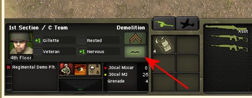
The first thing missing as stated already is the floor/passenger/open status here shown under the portrait. HYPOTHETICLY speaking given the available space in the LATEST GUI I don’t see anywhere else this could go. I stress latest in CMFI as under the portrait in the current CMBN it doesn’t fit hence I ended up presenting the version with Clint Eastwood. In CMBN the line of type that contain experience and morale is lower, and more flush with the bottom of the portrait, which cramped the type. Now it is moved up with less space between in the two line that have name fitness, and the bottom line experience/morale. IF HYPOTHETICLY given the current given space where else would be better without much shifting? (ps. I am using N.Dudes screen shot, hence the red arrow to point out the mustache)
SECOND:
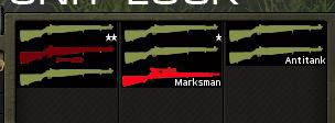
In CMx1 there was a color bar that went yellow/ red along with the integer change. This was the best. In CMSF the integer was lost, and went straight color. People wanted more exact so integers were added, and the color was removed. Shown are two color ammo level warning markers added yellow= low, red = out. Note there is no green as it is not needed. Here less is more. As the player I don’t want to have to micro manage, and constantly have to keep reading the integers. I just want to glance over at the ammo, and if I see a warning marker then I need to read the integers. You will also note that if an ammo is out it still remains with a red marker to alert the player that a weapon currently being held is out of ammo. Currently it disappears. and the player finds himself with submachine guns on the attack with no ammo because he did not notice it. Just a simple warning marker makes all the difference here in micro management time, and situational awareness. To incorporate I narrowed the suppression meter slightly, and C2 icons just a little bit. These markers can be modded to blues for the color blind, and reduce micro management time greatly.
-
Steiner, I have to be honest in that I believe you are going way to radical than what is necessary. The player already sees that a unit is panicked with highlighted border that appears around the word panic for example, and the faded unit icon. I have never not known a unit is in panic unless it was out of camera view, or not selected. (The ROSTER concept here: http://www.battlefront.com/community/showthread.php?t=104982 addresses that. Latest refinements are at the end of the thread) I also, think the suppression meter is more cut and dry in conveying LEVELS of suppression at a glance. I can draw different portraits with different levels of frightened expression, and it would not be as clear as the suppression meter. I Hear where you are coming from, but really do not see it necessary. I am a straight shooter when I critique, but It is always good to brainstorm though as you are doing. I just don’t see the need to get rid of the suppression meter in its effectiveness.
I agree with Steve that color with unique shape is best for rapid association. To prove these points look at traffic signs, and signals. The last thing one notices on a stop sign is the word “stop”. Also, the guys running around flight decks of aircraft carriers are not wearing all those different colored shirts just to be stylish. As far as the use of color for rapid association it is effective for the MAJORITY, so sacrificing color for the better of the MINORITY is not practical for mass appeal to a larger audience, which equals larger sales. Another reason color should not be sacrificed if it is the best way to convey information is because any bitmap color can be changed to whatever color a person wants through modding. In this way the best design is not sacrificed while the color blind can have their shades of blue. Most of the game could be done in entirely blue monochromatic scheme to make it most appealing to the color blind, but then 90% of the sales would be lost. I certainly would not buy it that way. If I made my posters monochromatic to appeal most to the color blind I am guessing I would have sold 50 units instead of the quarter million I have because I appeal to the MAJORITY first. My advice to the color blind is YOU adapt to the MAJORITY by learning photoshop to change thing to the minorities needs. In this way minority color blind grog, and majority color loving grogs can all live together in harmony, and get what they want while not impeding on the other guys wants color wise
. Perhaps womble should learn photoshop to help himself, and the rest of the color blind to stop complaining about things that can be easily changed to ADAPT to that minorities needs. I noticed they reduced the colors on the command buttons, but you do not hear me complaining because it is the first thing I will change, as I prefer the CMBN colors. If I can learn photoshop, I am sure he can as bright as he is. Womble become the savior of the color blind! As far as the information given in the UI I think it is fine, and definitely not a game breaker, however a few things here, and there will reduce micro management. As I said I think the UI is good as is, but just needs FOUR more things as far as I see for the entire panel. One we already covered in the desire of having one more line of text incorporated showing floor/passenger/open status. I’ll put some illustrations together to show. Steve, you are going to like it because it really is not much radical changing I will show, but will make all the difference. Time to start painting.
-
I have been meaning to go through this thread to see what is going on over here creatively. I think it is clever of noob to find a way to add a tactical layer to the game for those who are interested in that, and have other game. I’m not really into it, but if it were added to CM in a more simple way such as TOW3 did I wouldn’t mind it. Perhaps something like a Tac layer could also be added as a feature offered in an upgrade.
 . Rushing an assault will not work in a game like CM as it would in a gamey RT type game. The last guy I recall who tried to rush in on a objective with his "super panther" got a bazooka round up his ass. There is time for speed, and there is a time for patience.
 Till then I guess I’ll just have “Vin’s imagined portrait text mod” to hold me over till 3.0.
Co-op Needed!
in Combat Mission Fortress Italy
Posted
When I say I would like to see Co-Op in the future I do not think it would be anytime soon. PC power for the average joe would have to be able to handle the size of a map that would accommodate a typical regiment size frontage. Not sure how big that would be, but probably more than the average PC to handle without LAG. Preventing lag in real time battles of this size is where PC power would have to catch up for smooth game play with all the under the hood calculations the game has to make.
Co-Op Human v Human is where it is at for gaining popularity. Against the AI I feel it would not be as popular since The AI is nowhere a challenge to humans. AI for this type of play would take much more work to script rather than human vs human play. My advice to the developers would be not to worry about Human vs AI Co-Op to start with, and concentrate on HvsH for initial implementation someday. Real Time Co-Op seems like a logical direction for the game to take eventually now that real time is part of CM. I KNOW it would be big, and would gain whole other market if advertised properly. If Sudden Strike could get that popularity I know CM can since it a far superior game for realism than Sudden Strike was. Sudden Strike is good to look to for learning from for a successful model for Co-Op play though. Also, seeing the mistakes the developers of Sudden Strike 3 made is a good way to avoid the same pit falls.