

Vinnart
-
Posts
2,570 -
Joined
-
Last visited
-
Days Won
4
Posts posted by Vinnart
-
-
The text needed just a tad more negative space around it to read easier which I changed. This reads easier at 100 %, and does not feel as crammed. 11 characters can fit there, with minimal cropping to the portrait. I know they have a plan, and am not insisting here, but I just wanted to show this not as bad compositionally as originally thought with the fix. Now if the words in other languages are so much longer than 11 characters then perhaps a problem there, but that reads as easy as any of the other text now that I fixed it.
-
I also agree Steve, that in the first design the floor ectt… does not fit in there contextually, but was more in an effort to find space for the text. I honestly don’t think under the portrait is that bad of a spot though considering it is no more difficult to read text there than any of the other text in the UI. It feels more correct there considering the available space, and it is away from the other modifiers. Like I said though I am just glad there are plans for it in the future no matter how you plan to incorporate.
-
Steve,
I don't understand, if there are six or more elements involved, why can't they be named?
I think that would be a lot of text. Would you really want an entire sentence around the cursor.? From what is sounds like they are aware of our request, and plan to implement in the future in a way they have planned. As long as they are aware, and planning to improve, which it sounds like they are, then I am happy

I only hope they do not fix things in the UI that are not broken. I think it is very good as is now in many ways, but just lacking a few things here, and there as finishing touches such as the floor info ect... I mean it when I think it is good overall.
-
Not going to happen

Guys, going at the UI piecemeal, hap-hazard "this can be crammed here if we do this, this and that" is the best way to wind up with a UI nobody is happy with. Changing the experience level to a modifier is absolutely a terrible idea (sorry, it is). Sticking the location of the unit in with a unit's inherent qualities is non-sensical (sorry, it is). Jamming the floor text in the same width as the portrait means squinting to see it and probably lots of abbreviations for things other than floor and/or different languages. So that's not a good idea either.
So while suggestions are appreciated, it is best to leave this to us to do when we have time to do them properly. And yes, there is already a comprehensive UI overhaul planned which addresses these particular issues and MANY more over time. Most should be in by Version 3.
Steve
I disagree one would be squinting anymore to read text there under the portrait than reading any of the other text in the GUI. As far as info there it really is just three words, and not a major overhaul. The words fit there fine in that font size, which is the same current used.
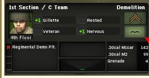
# Floor
Passenger
Open
That is cool though. As long as you see the reasoning for a reasonable request such as having this info, which you have since you say you plan it in the future I am satisfied, and look forward to sensible incorporation in future builds.
-
Here is the latest, and best by far:
Included more detailed icons to reduce color, so simpler yellow/red icons stand out more. This gives it a more “Combat Mission” look, and improves what is important to pop out more. Here shows a company, and size if full screen length.
The generic runner clip art I grabbed is now a soldier, and the green lightning bolt is now a soldier looking though binos (spotting.)
-
Also, isn’t the whole generic icon thing pointless, since when you click on an enemy it tells you what kind of unit it is in the GUI? If that info were not displayed in the GUI I could see it having a point.
-
Basic Training is good for the first couple of games, so you can see how enemy status changes "in real time", and learn a bit quicker what it takes to break or destroy an element, but I, personally, playing WeGo, see very little point in going beyond Warrior; it'd just make me frustrated with the interface. RT would be a different story.
I agree. I have played all levels and do not find much difference in difficulty in WEGO between them. The differences play out more in real time when it is not as convenient to move the camera to know more about the enemy. I prefer to play in veteran since it shows what the unit sees instead of having to zoom to the enemy models to know more about them. One can find out the info in the same way only one is like changing the channels on the TV with the remote control vs getting up to change them. The only other real difference between Veteran, and Warrior is the different time delays, which is no more than a minute difference between them. I agree with womble in playing anything above Warrior in WEGO is pointless, and is just to make ones ego feel better. I have played them all, and like Veteran, and Warrior best. Basic is for total noobs to learn the game easier. Playing in Iron in real time is just frustrating. Frustrating is not fun IMO.
-
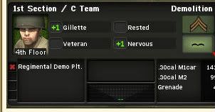
Yes, I think the last illustration is best in solving the where to put it in regard to the available space? It looks right there.
-
Here also, would be a good, and actually more logical place for this information text as shown with the portrait. Since the text is only pertinent to certain status such as floor/passenger/open it would only appear when necessary. Not sure if this text box could be made to appear only when necessary, or would need to be there permanent. Either way it is more useful to the player than the portrait itself. Text is already covering parts of the weapon silhouettes, but that can be improved by simply flipping the graphic to point right instead of left.
In the way I am showing it it fits in nicely not to cover much.
-
Good to know --- but any chance of a Passenger/Floor/Buttoned info word in the UI ?
I know it's "more in the UI", but it is/would be extremely helpful info to have available at a glance.
Thanks Steve for the feedback. As you see I am not alone in this request. I am not going to critique this new section change in the new GUI further till I see, and use the product personally. I agree, and never thought the terrain would work in the GUI for the same reasons you said. In not seeing how the 6 boxes would be laid out I thought the terrain thing would be thrown in as a perhaps there would be space to fill if the bottom six boxes were left at the current size. My main hope was that a new line of text was being incorporated to fit on the bottom stating what floor on/passenger/and open status. Surely, that information being shown for practical reasons would reduce camera management when knowing that info is precarious from certain camera angles. I hope you find a way to incorporate it in the future. One more line of text will not make the GUI seem more cluttered, and knowing this without having to re-orientate the camera is a good thing. If I thought I was wrong in this I could not produce many camera angle screen shots that no one could tell this info for sure without having to move the camera. I still think the easiest place space management wise to incorporate this is by minimizing the experience level into the un-used modifier box which is currently waisted space similar to this here shown with a letter, but a number system would work too:

The floor status ect… was in CMx1, and was useful. Again, as a customer/player I hope you see the reasoning for this request.
-
It's obvious you have "playtesting fatigue". You have been working hard, take a break. I will sub for you.
It could be that, or no offence, but some people are just more observant than others. I think I would make a good beta tester if a position opened as I have been dealing with design, use of space, color, and composition in an occupational way for over 25 yrs with credentials to back it up. If a position opens up Battlefront please give me a try as I would love to work with you. This has become a passion of mine.
-
I like the fact that special weapons etc. will now just have one icon each and the number of pieces/rounds remaining will be displayed as a number instead of multiple tiny icons. It's definitely a step in the right direction - I believe the real change to the UI will be implemented in the next 'family' after CM:FI.
I agree too as I said, it is a step in the right direction in that it consolidates that information, and assures 6 different special equipments can always be shown at once. This makes sense. It wouldn’t be good design if 100 little bullets were shown instead of an integer now would it? What they did looks as if it could have been done in smaller boxes opening space at the bottom for the info I describe mainly to make room for 1 line of text to show floor status ect..
In regard to a terrain graphic being shown in that box too I thought of that as something to fill some open space that would be there in the design I mention. The words “4th floor/Passner/Open” would only take up one line. The terrain is much more complex now in layers, and infantry dispersion so it does not fit in a neat little box. The leader however, can only be in one type of terrain at a time so I thought they might be basing it on that to try to make that fit for new guys in a general way. Again though I do not find that important info for the GUI ala Cmx1. The main thing I would like to see is the floor status, passenger/open, which is practical in reducing dealing with camera management.
There was a big thread I recall about the terrain confusion in the early days, but I think most have got the hang of it as we told them they would with a little patience and experience. If the desire is to have terrain ratings in the cursor, which is the only sensible way with the terrain complexity I think it could be reduced to a number for the noobs, and perhaps to help the color blind as I am expecting this is why womble would like that. How would you compare Miss Walmart to Miss November on a scale of 1 to 10? You see one can make a rating scale in comparison for almost anything in a general way albeit not perfectly scientific. Even here if it a colorblind issues all terrains can be modded to be monochromatic color scheme.
Staying on topic though my first impressions is this GUI design could use its space more efficiently. The biggest killer in eating up horizontal space is hot keys due to the words, and only a few long words at that. They are the biggest hot keys I ever seen in a game. If there just a little more horizontal space the integers could have been worked in differently using the smaller special equipment icons.
-
I really didn't care about terrain tiles being show personally as I described since I got that down long ago. Looking at the space I thought they would have did that to mimic how it was shown in CMx1 to help the noobs. I haven’t heard much bitching about not knowing what terrain a unit is in awhile so hopefully most have got comfortable in understanding the terrain. As far as the info I want in the floor/passenger/open status I could post plenty of camera views that nobody could tell for sure unless they moved the camera to different angles, which is needless micro management. It is so much quicker, and easier to just get that info in the GUI. CMx1 had it better on that one. I hope they plan it down the road. Be all you can be. (I thought that was one of the U.S. Army’s best slogans.) Another good one I like to say that is similar is why have Miss Walmart, when you can have Miss November? Be the best, and have the best!
-
Thanks N.Dude, I haven’t been following your battle with Bill regularly so I missed that. Thought they were keeping the GUI a surprise. As far as space goes I feel it can have been used better in the sense that we really did not gain anything more such as I described
 . I still will continue in the sensible wanting of floor/passenger/open status shown in the GUI. This would be more helpful rather than just having larger icons. Basically the special equipment icons are just bigger. A little disappointed in that regard.
 -
According to the features list the special equipment boxes have been reduced from 12 to 6 using numbers to now show how many of an item. I think this was a smart way to consolidate the info to open up space for more things. So, far this is a mystery as to the changes it makes to the GUI as there has been no screen shot I know of of the GUI for CMFI.
I predict the special equipment will now occupy the first top 6 boxes, and the new box underneath will now contain a graphic depicting the base terrain tile/building, and floor/passenger/open information! Either that, or more ammo for infantry, but the former is what my combat antenna is leaning toward.
What do you guys think?
-
As someone who has tiled large floors I really like the Tile Seat concept! Not to mention your original CM improvement!!
Thanks dieseltaylor. I came up with it when I tiled my house. I searched for such a product, but could not find it, so I invented it.
-
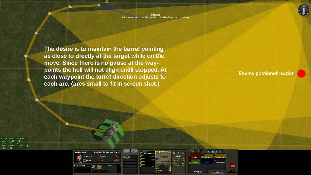
Just a quick clarification. There's no need particularly to use a shift-arc; that just gives a circular arc. It's entirely possible to make a short wedge-shaped arc instead, if that will help the spotter face the right way, say, to see through some Bocage.
I agree with womble this is better, and the best thing is it visualy reduces the mellow yellow. The player can also get a better feel for the facing of the unit with a semi circle, or wedge from high camera elevations. The circle arc seems best for ambushing in buildings since entrances are usually opposite sides.
As far as arty goes I would say 90% of time I use light short or quick on known spotted targets like ATG, and harrass for long pinning down of enemy advance. One can keep the enemy opponent off balance for almost the entire game if used right. Had a game not long ago for 45min, and denied him the crest of a hill for almost 30 min this way. Keeping it open long with harrass allows for quick adjustments since comms is already established, and only shoots a few rounds per turn to save the most ammo.
I really like how the arty is modeled in the game now as compared to the first demo of it. It was just too overpowering becuase the men cannot spread out more like in reality. One round was taking out entire sqds. Since then it looks as they have abstracted it a bit I think to compensate for the games limitations. This was a good thing.
-
TOW war has that. Honestly I didn’t use it because it became annoying preferring to pause at my will. Really don’t see the need in WEGO as one can easily rewind, and pause to catch things. For real time perhaps some might like that, but again during single player one can pause at will. Also, one can scroll through the Roster at any time for quick review at a glance of the condition of all the force. For these reasons I would say that is more on the “would be nice” side IMO, and less on the necessary side for function.
I see the WEGO benefiting from it during the replay to not miss something. Sometimes I will miss something in a replay because I did not watch it from a particular angle only to hit the red button to find myself in command phase saying “wonder what happened with those guys?”. In Command phase I see it convenient to scan through it to see all’s conditions in one comprehensive report that one could only get otherwise by selecting each unit individually.
The biggest benefit for this is to the real time HvH player. He will find this tool most useful in SO many ways. As an alert system seeing all that otherwise could not be seen., as a navigation system, and as a management tool that reduces micro management which is another challenge all RTS games face.
-
EXAMPLE #4
-
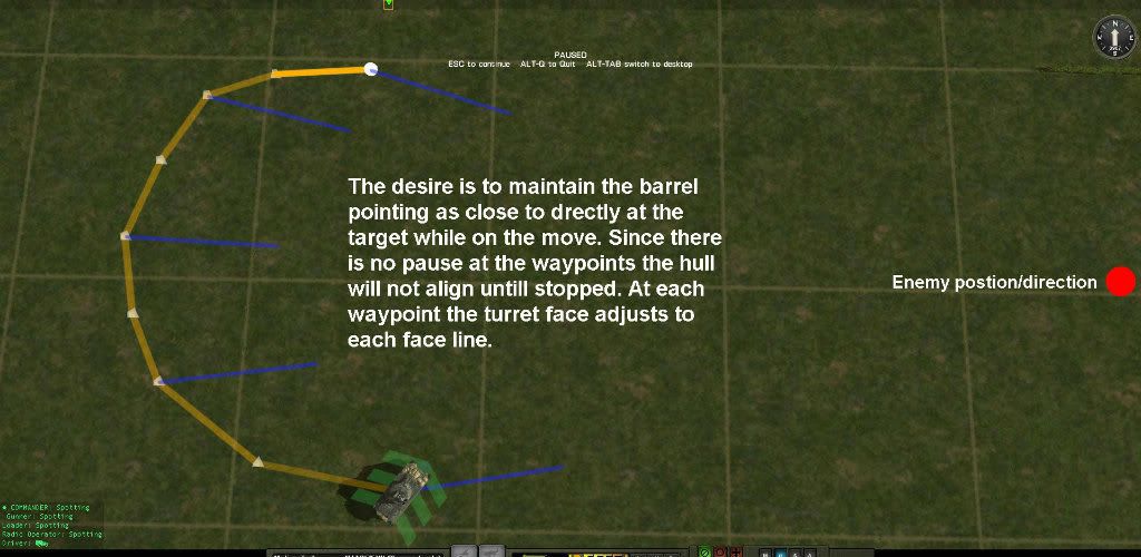
Compare Examples #3, and #4, which are accomplishing the same thing. Which one do you think was faster to plot? Now imagine getting the turret to do that while playing real-time. Instead of drawing arcs, which can be harder while the tank is moving the face in this way quicker to issue, and with more precision. Which one looks more visually appealing since in this case all the player wanted was to point the turret without having to worry if they made an arc deep, and wide enough.
EXAMPLE #3
-
EXAMPLE #2
-
.(Quote)
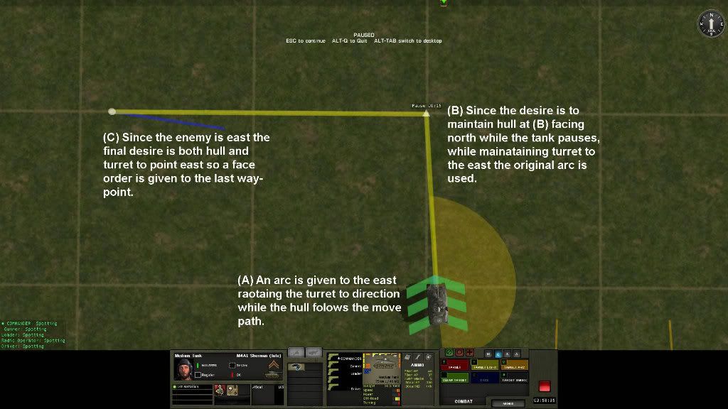
1.My tank is at A, hull pointing north.
2.I issue a Face east (so the gun will rotate to point over the starboard side of the tank.
3.I issue a Move order straight ahead so the tank moves North to point B.
4.At point B, I want the hull to be pointed North. Because, under the described suggested scheme for Face, the hull would be turned East at point B, I have to issue a Face order North, or replace the Face with a CA whose midpoint points East.
(At point B hull is already pointing north as that is the direction of hull movement. The hull will only realign with turret if stopped, or paused. The tank will move through (
 while the turret remains east. If one wants hull one direction while turret another then a cover arc is needed.)
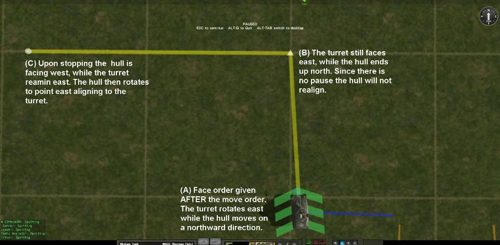
5.From point B, I want to move West towards point C, but keep my gun pointing East. If I order a Face East, my hull will turn towards the East before continuing on to rotate to point West and move off, a behaviour I do not want.(Quote)
The face order must be given AFTER the move order to do this. The hull will continue on the westward movement path.Depending on circumstance desire sometimes a CA would be better. One thing is for sure one would need to make less and have more control over the turret on the move.
Face, and cover arc have no conflict as the orders cancel each other out since only one can be used at a time. If one can still command as it is now. Really it only adds, one can still have a face command at the last waypoint to get hull, and turret to face a desired direction. Issuing the face order after the move now still gets the tank to face both hull, and turret at the last waypoint. The only difference is that the turret faces in the desired direction on the move.
Benefits:
1. Turret arrives at stopping point with it already oriented toward the enemy making it more combat ready. Tank is not as confined by an arc to threats outside the arc, while the turret is facing in a more combat ready posture toward the enemy.
2. Quicker, easier control over turret pointing, especially for real-time, while the tank is moving.
3. This only adds, and takes nothing away which gives the player more options.
4. More visually appealing when arcs are not needed.
Here are the move options for your path. You are more than welcome to post your own to point out something I am missing. Example #1,and #2 are your path and some options. At point (
what happens if an enemy appears out of the arc? It will be ignored, while the face command will be overridden by the AI.EXAMPLE #1
-
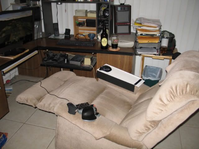
“Armchair General Sleeve” – A sleeve that fits over the armrest to move the mouse on in total comfort. The edge is slightly raised to prevent mouse sliding off. I love it! I added a pad at the elbow that is not shown in this pic. Another good one I came up with is the “The Tile Man’s Seat”. If you ever layed tile you would love this! It is a tile caddy with wheels one kneels in, but has a bicycle seat at the end of a bar that extends to rest the rear end on. This reduces fatigue greatly. Now I just need money to manufacture these things in mass. Posters were much easier to make in mass.
-
FURTHER SOUND TROUBLESHOOTING:
Drawing from my experience with the Sudden Strike series sound can be helpful, but if over done it can be annoying. In that game series Sudden Strike 2 was Fireglow’s (the developer) most realized. They did a Sudden Strike 3, but just like a guy who has a beautiful girl, and doesn’t know what to do with her they eventually flopped because they did not fully realize their game. Mainly because going from great multiplayer support to the worst I think ever in the history of gaming. Multi-Multi player was why the Sudden Strike 2 sold over 2 million copies. That game was a great learning experience.
As I have said there are common challenges ALL real time games pose to the player. This is the ability to manage command and control, often of many units, and the ability to see all the units at all times as there is only so much the camera can fit in the screen at one time. To compensate for the later many RTS games have a mini map in the corner. In Sudden Strike 2 when a unit was attacked out of the current camera screen an orange marker would appear in the mini map along with a ping sound to alert the player of problems happening elsewhere. Often the sound would be the prompt to look at the mini map. This was a good use of sound. In SS3 they removed the sound, and it was a big step back for that function of that game. It was a noticeable difference in what one would catch. Often I would not notice the orange marker alone missing events. In SS2 if a unit was out of ammo it would sound off “Out of ammo”. This was good, but the problem was the guy would keep repeating over, and over again which was annoying. If I couldn’t supply him I would end up shooting him to shut him up. This is a bad use of sound.
In testing with something like this if words become overdone, then I believe just the sound of a radio schwelch when the mic is keyed would be something to try, and would be suffice enough to alert the player to glance at the roster. Of course, there will be dudes like Mord who would probably make something more dramatic sound wise if incorporated. I can hear him yelling “Man Down!” already. As long as the files are there in the first place they can be changed, or eliminated all together if desired. You can take away, but you cannot add.
One thing I know is testing is essential to find the best design. We may find sound really isn’t needed at all for all that is known in concept.
Da Vinci had his notebooks, and I guess I have the Battlefront forum as mine as far as my interest in war game design goes. It’s an artist thing, and another way to creative buzz. It is like I have to get it out of my system. I certainly don’t think I am as brilliant as Leo, but I think he would be proud of my “Armchair General Sleeve” invention.


 . I still will continue in the sensible wanting of floor/passenger/open status shown in the GUI. This would be more helpful rather than just having larger icons. Basically the special equipment icons are just bigger. A little disappointed in that regard.
 while the turret remains east. If one wants hull one direction while turret another then a cover arc is needed.)
Concern over "pausing" in TCP/IP games?
in Combat Mission Fortress Italy
Posted
I think this was smart move on Battlefront’s part with the difference modes between camera control, and orders, both, or none. In that way more variety can definitely be obtained, and the guy who is not getting rid of a warm one to refill with a cold one doesn’t gain an unfair edge.
I do have one other pause mode I thought of to at least experiment with which I have never seen or experienced. This is a timed 30sec/30sec hybrid RT/WEGO mode. In essence this would be similar to speed chess. If asked on this forum why WEGO only guys don’t like real time play I am confident the two most common answers are: I find it too hard to manage many units in real time, and I do not like the clickfest. My thought is merging the two types of play in which the game has two timers. The one we have, and a 30 second one that counts down that auto pauses for that time for a command phase. It would have a 30 second pause command phase, and a 30 second real time play cycle. This gives the player 30-second intervals to evaluate the situation and issue orders along with the straight real time phase. Perhaps many who have stayed away, or did not like real time play, OR WEGO might find a ground in the middle that would provide a different type of CM experience that is fast, but mot too fast for taste. I don’t think there was ever game mode as I am describing. The only draw back I see is the time of the games with the longest probably going 90min to 2hrs (ie 45min, and 1hr battletime.)What is great is now that pause is available in real-time so I third guy with a timer at the office could keep time to see how something like this plays especially for WEGO only types. Just brainstorming, and throwing out thoughts. The pauses we have now would work on top of this I.E. you can pause during either time phase pausing the auto pause countdown.