

Vinnart
-
Posts
2,570 -
Joined
-
Last visited
-
Days Won
4
Posts posted by Vinnart
-
-
I think this would streamline arc creations, and manipulation incredibly. It would be created similar to how 360 degree arc is made with a single click (more efficient than two), but is 180 degree instead. This was available in Cmx1, and I used it 95% of the time. The player would hold down ctrl + target arc command and drag to size. Once, the desired size is achieved the player clicks creating a waypoint at the center. Once created the player can drag the waypoint to resize, and rotate it while it remains symmetric. In this way a player can keep manipulating the already made arc on the fly instead of having to have to re-create new ones to change size and direction. This is smart, sensible and efficient. A player could theoretically go through a whole game using one single created arc.

-
I would think this not too hard to do. I don't think you will be able to get them totaly invisible, but should be able to get them very faint in that they are hardly noticeable. In photoshop try cutting away all of the color, then repaint it adjusting the paint to a few percent transparent. Then, just paint in the new transparent color with the brush. Not sure if this will work, but sounds like it may.
-
I really like the improved FoW “?” icons! I was wondering how they would do it. I know this will make a big difference for the real time players who often may miss spotting what the WEGO player can rewind and see.
-
I don't think "covered arc" + "hide" works very well for an ambush - troops that are hiding don't spot too well. It's mainly a problem in WEGO (which i only play) - where you have to wait a whole minute, in a situation where the enemy moves into a units covered arc, but isn't spotted (because your men are hiding, and have reduced spotting) - before you can unhide them a fire, by which time it may be too late, it's compounded by the fact that you can't check LOS - because this is measured from your still hiding unit
 I believe this is because WEGO is RT with pauses, and is therefore a limitation of the engine - hope I'm wrong!!! Ambush is therefore needed.
From my experience I agree hide + cover arc is not good. I thought it was in my limited use first in CMSF in single player. I found out otherwise the hard way. My very first PBEM I had to set an ambush and tried hide + arc and, it was a disaster! Short cover arcs give good concealment + better reaction times, and spotting ability alone rather than with hide. Giving a slow move the last few meters usually sets them prone for the ambush. From there set the arc, and you should have an effective ambush in spotting, and firing first. TERRAIN concealment has much to do with success. Many the time I have had guys in buildings with very small arcs, and was not spotted till enemy moved in to the arc.
-
I had that happen recently on that map too. The only real casualties I got were becuase of that. They ran right around and got nailed by a HMG. Here is the thread "Magician units" that has some nice close ups of their dumb ass's sprawled out all over the road on the opposite side of where the door was.
http://www.battlefront.com/community/showthread.php?t=105018
What can you do, but drive on. Its just one of those stupid things that happens every now and then. It's a bug like all games have. For the most part I don't experience too many problems with path finding. I have found that usually more plot marks are better then less for smoother pathing.
-
It looks good to me, but I guess BF would probably stick it in the "nice to have" pile, which is mostly obscured by the "must have" pile

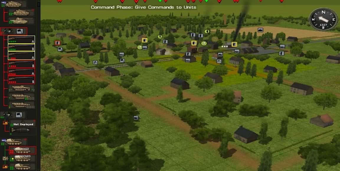
This one is a must have especially for the RT player, and especially H2H real time. This would be an optimal tool to address all the situational awareness, and management difficulties found in EVERY Real time game, and addresses many concerns all in one neat package. Even the WEGO player will find it very useful. If one does not see how this gives you eyes on all while seeing only some then the light needs to come on. Try playing H2H real time totally from camera level 1 to 3 effectively, and without frustration. With this it can be done. This gives you eyes 360 degrees at the same time, which is a problem all real time games face. In other words things are missed which is not fun, but frustrating. We want the simulation of combat, but not the frustration associated with it.
This also reduces click fest, and the time it takes to know everything about everyone of your units in a glance. To know all that is shown in the ROSTER one would have to individually select each unit. All players will get a much better overview of their force in a new way that is more efficient.
Little, by little CM is adding the missing pieces to improve situational awareness. The lobby went out for more unit icons, and all saw it was good. The lobby went out for FoW icons to improve the contact markers to let the player know what was seen if his eyes were elsewhere and missed it. All will see this is a very good thing especially for the real time player.
My roots in war gaming are in Real Time games that were much more chaotic than CM. This concept comes from understanding the limitations that real time players face. They all give the player complications to overcome that the WEGO player who has never played a real time game cannot understand unless they have experienced it. The ROSTER addresses these limitations, and overcomes them.
-
ICON VARIATIONS AND EVENT WARNING INDICATORS
Here are variations that could be made. I think they all work effectively. Since there are more than 3 types of C2 icons then 5 bmps would be needed for C2 to have it that way. (radio, voice, close visual, far visual, and out of contact). This would make it possible to have the detailed C2 variation while still making it possible to have the original simple approach of 3 (green, yellow, red) circles. All that would have to be done to do this is give good C2 markers (radio, voice, close visual) the same green circles, and yellow for far visual in place of the detailed icons.
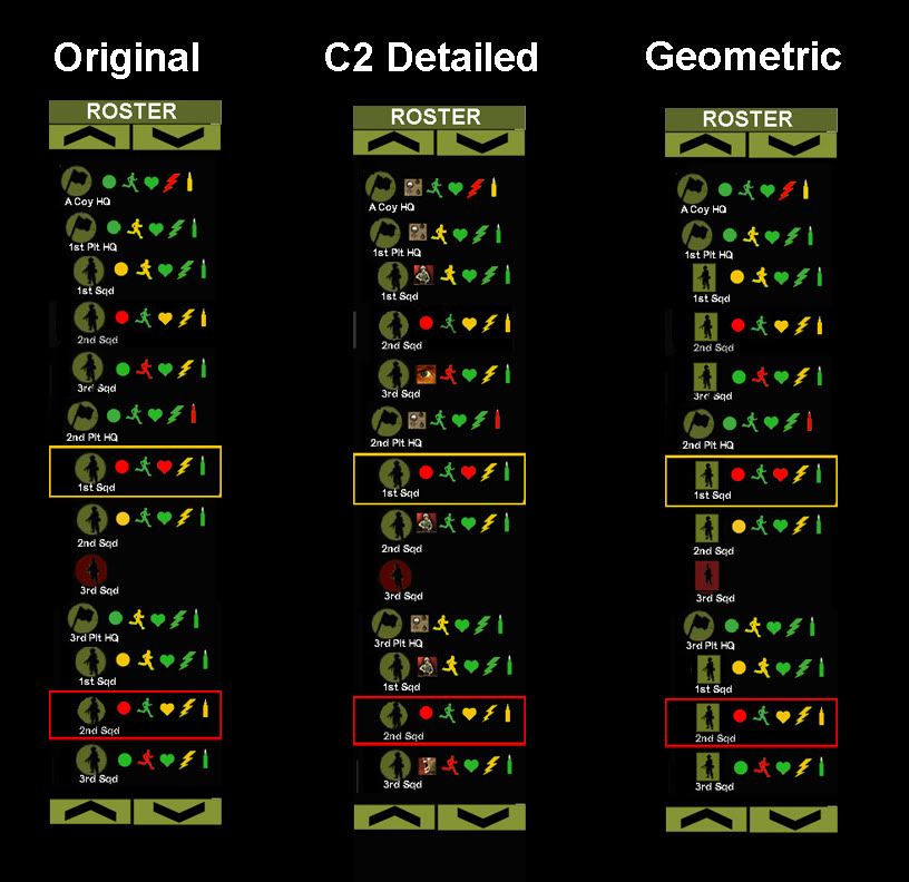
ADDED EVENT WARNING INDICATORS: Added as you can see are event warning indicators. This is either a luminous yellow, or red boarder that pulsates slightly, and appears around the unit box in the ROSTER for about 2 seconds to highlight that a new event has occurred. EVENTS are slipping into the YELLOW, or RED in any of the categories C2, Fitness, morale, contact, or ammo. After 2 seconds the event warning indictor disappears, but the color change to whatever event icon remains as long as the unit remains in yellow, or red status. Event warning indicators are shown in the order they occur to the micro second. In cases where events happen simultaneously to the micro second then a condition of priority would be established as to which event indicator to flash first. Example the unit lost C2, and got tired at the same exact moment. In this case a second 2-second yellow flash would follow one 2-second red flash. Just like the C2 in the game, and in reality only so much information can be processed at one time so in some cases a slight delay from what happens real time on the battlefield may occur in its mirrored ROSTER with the EVENT WARNING INDICATORS. Icon color changes will have no delay, and will happened immediately, but the event indicator may lag a second or two to alert the player that an EVENT has occurred.
So from looking at the ROSTER we can see the latest event for 2nd platoon’s 1st Sqd. is YELLOW, and since the only yellow icon is the lightning bolt then we know it is new contact. From looking at 3rd platoon’s 2nd Sqd. the latest event for them was a change to RED. In this case we know it was a lose of C2. There will be cases where there may be few icons that are either red, or yellow at the same time so it may not be clear which is the newest event. To know more about what is going on players would want to select that individual unit which can be done via the ROSTER too.
You will also notice icons have been removed for the destroyed unit since they are no longer relevant. This removes unnecessary graphics to keep the ROSTER from being cluttered with information that is no longer needed.
SCROLL BARS: The latest build shows alternate ways to have scroll commands beyond side scroll bars. In this case they are clickable buttons located top and bottom. Click for increment scroll; click and hold down for faster scrolling. The advantage of the buttons is it makes the ROSTER narrower. The disadvantage is they take up room to show a few less units. Either way the top/bottom are optimal placement as new EVENTS from units not shown in the current ROSTER window will appear at either the top or bottom of the ROSTER window depending on their placement in the organization tree. This occurred with Roster’s AUTO SCROLL feature. Players can manually scroll, but during doing it it will override auto scrolling.
NEXT: The incorporation of sound. TO BE CONTINUED …..
-
I love any way that makes info more visual and less verbal. So, well done. But can these be implemented by modders or would it take BF deciding to implement all this?
Also, thanks for the nVidia settings, Vinnart. It's always interesting to see how others optimize the settings. Was curious why you only have 3 prerendered frames. I use the max of 8. Doesn't more make things smoother?
Thanks Erwin. This would definitely have to implement by BF. I am not a programmer so I do not know of how difficult, and what complications are involved in making something very close to something like this with ALL these features. For example I recall comment about scroll bars being difficult to implement for the saved game screen. In this case for example use what we can. Create buttons to scroll as in the way it works in the QB purchase screen. UP/DOWN. Things like making the box dragable to size to taste might be a pain for all I know. In that case having the bar extend the length the screen would be best to show the most units for large forces. You can always click the ROSTER button to make it disappear if one wants. I would rather have it there of course because one gains much more, and easier situational awareness of the force than they lose in scarifying a bit of battle screen. Long narrow vertical format is space efficient, while offering the most room for the longest list. List format is definitely the format to stay organized for this. I am confident it can be done as I have seen similar controls on side menus in other games.
In regard to the Nividia Q I’m no expert. I only know that I finally found a happy medium given my system specs between detail and FPS that works for me.
-
Ok, the roster is a good idea, anything that can make information easier to process is a definitely worth having.
noob, I know it in my bones. When I feel it there, and have this kind of creative buzz I know I am on to something good.
It solves many situational awareness concerns, and is one of the last remaining pieces of the puzzle to make CM the BEST controllable RTS game over anything else I have seen to date.
-
Here is another old idea that is no longer necessary since it is also incorporated in the ROSTER.

-
Why don't you use the voice, eye, figure icons that come with the game for the C2 symbols, people are used to them so it would be more user friendly, then use your symbols for the rest of the information.
Yes, that is certainly a possiblity.
Look above noob (post #15)
"In regard to Erwin’s comment of using different symbols to show different status this is also a possibility, and offers more flexibility variation. For example instead of the circle I am using the different C2 markers Clark is showing could be used (radio, voice, ect..). The bottom line is that as long as the bmp’s are there in the first place they can be modded for variation to individual taste. If I want different color circles, and you want the more detailed C2 markers it can be done. Anyway the Roster should have its own set of Bmp’s separate than the battlefield unit icons. For example this would be needed if one wanted the battlefield unit icons to be blue, and the Roster unit icons to be olive green they cannot share the same bmp."
-
In the past guys have said it would be good to know more about the situational awareness of units when out of camera view, or just by looking at the screen. There was a thread geared toward playing the game at ground level for a more immersive experience and the wanting of a radio traffic log similar to TOW so I thought of this:

Obsolete!
The ROSTER is better, and so much easier to make sense of at the glance. Most RTS games are played in an overview, and do not have the terrain sophistication so going to ground is not as important. CM however requires the player to drop low at times. The problem is you lose sight of the other units and can miss stuff. The Roster allows you to still “see” units that are not in the current screen. One could play an entire game from ground level, and still know what’s going on with the units on the other side of the map out of camera view.
-
REFINING THE DESIGN:
ROSTER v3-
Graphic changes:
*Added slight indents for a more organized outline format to better show separation between platoons, and to better show the hierarchy to find units easier.
*Improved icon spacing, and sizing (made heart smaller).
*Changed to less saturated green.
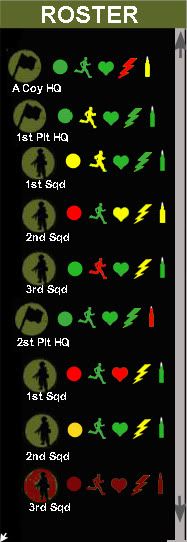
Added function:
As stated the Roster unit icon should mirror the battlefield unit icons.
*Selected battlfield icons visible in the current Roster window should highlight in some way if in the current Roster view.
*Casualty icons in the Roster should flicker too. The scroll should also automatically move to either the top, or bottom most slot(if unit is above/or below the current Roster view) To alert the player that a casualty, or that any unit has changed RED status. Example: In the Roster shown 3rd platoon is not in the current view. 3rd platoon HQ takes a casualty. The roster would automatically scroll till 3rd platoon HQ is shown in the bottom most slot so that the player is alerted to it, and does not miss it. The Roster automatically scrolls just enough to get the needed unit shown. This auto scrolling only happens once to alert. In other word if the mortar is out of ammo it will not keep moving the scroll to be seen in the current window view after it alerts the player once.
*Destoyed units should be dark red, and faded.
In regard to Erwin’s comment of using different symbols to show different status this is also a possibility, and offers more flexibility variation. For example instead of the circle I am using the different C2 markers Clark is showing could be used (radio, voice, ect..). The bottom line is that as long as the bmp’s are there in the first place they can be modded for variation to individual taste. If I want different color circles, and you want the more detailed C2 markers it can be done. Anyway the Roster should have its own set of Bmp’s separate than the battlefield unit icons. For example this would be needed if one wanted the battlefield unit icons to be blue, and the Roster unit icons to be olive green they cannot share the same bmp.
NEXT. I want to do a mod for it using Wolfe’s geometric icons to see if the different shapes help to create more separation of platoons. I think it will.
To be continued….
-
Meanwhile on the other side of the world another guy, ClarkWGriswald, was also getting similar thoughts to invent the wheel. Here is a similar design, and concept Clark made. I applaud Clark for taking the initiative to brainstorm, and making such a nice graphic.
In comparing the two designs I feel mine is the more effective. I say this not because I made it, but in looking at it objectively. The “Roster” design is easier to process at GLANCE, in that it maintains a more KISS(Keep It Simple Stupid)approach.
*Easier to see the C2 marker next to the unit icon in a list format, rather than the eye to have to travel a lined path.
*It is more compact, and concise which also makes it easier to process at the glance. The more compact design also offers more room for more units to be shown in the box at any given time.
*Optimal placement is on the RIGHT side of the screen. Studies show people notice things more to their right. Ever notice webpages usually have the ads on the right side of the screen? It is no accident they are placed there.
-
4 YEARS IN THE MAKING. THE DEVELOPMENT PROCESS, AND THE REALIZATION OF REFINED DESIGN:
About 4 yrs ago I presented a similar concept to the developers of Sudden Strike to try to improve their game. Here is a pic of the original design that was placed in the strategic map screen for that game. The tabs were filters to show ALL, only infantry, tanks ect.. Here I am using a more “Theatre of War” approach.

Nice, but words take up more space than symbols, and do not process by the mind as efficiently.
Hey, I even spelled Roster right the first time for that one. I must not have been as Roasted that night when I made it

-
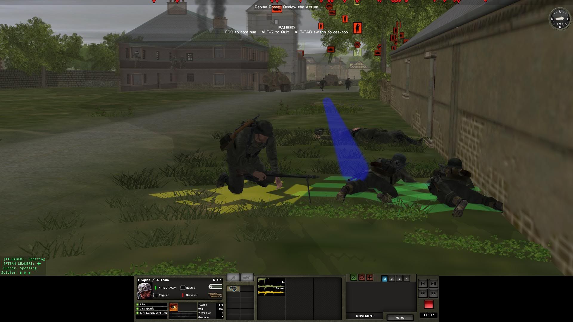
You know what would have been ironic if this squad would have ended up with the call sign “Houdini”, or "Merlin" instead of “Fire Dragon”, since I have both as soldier names too
-
You can see in this shot after the aid is done the PF is gone from the UI, and his back, and is replaced with the rifle.
-
Are you sure the PF is gone? Is it gone from both the 3D view AND the UI panel?If it's still in the UI panel I would xpect he'll whip it out when needed.
By the by, PFs are single use, and extremely short range, so I think it's rather unlikely that your success or failure will come down to this single weapon.
Yes, definitely gone. It disappeared from the UI panel. Agree the lose of the single weapon isn’t going to cause a defeat, but still I would rather it not disappear, and be passed to another guy in the squad that could carry it. The PF on his back changed to a rifle, when he picked up the mg42.
-
See this guy with the panzerfaust doing some medic aid on the guy with the mg42. I think he waved a magic wand because when he grabbed the mg42 the panzerfaust magically disappeared. So, now unless I have access to the Twilight Zone to make it reappear I have to go through the rest of the campaign a panzerfaust short. I would have preferred that the panzerfaust be transferred to one of the other guys in the team rather than disappear. This to me is more logical as to what would happen in reality. I hope this is something that can be changed.
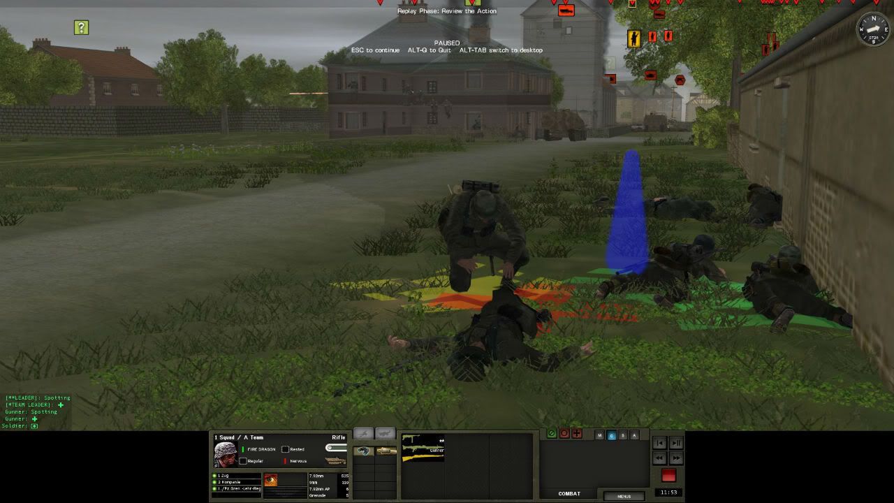
The real kicker is the dead guy there bought it due to a strange building bug. I gave a waypoint to the door on the other side of the building, which was a safer route. The squad then ran around the building to the door on the street side, which was covered by a HMG. Usually the pathfinding is good, but I cannot get any troops to go through the door on the other side, and I can’t get my panzerfaust back.
-
Thanks guys. You are right Erwin in that it is so obvious. To the left worked fine for CMSF because there was no text to contend with. I think all will find facing to the right looks much better for CMBN.
-
The landscapes are really looking unique. Great job with making the banana leaves. If I had CW, I would definitely check it out. I did download the voices to check them out, and I thought that was clever using the voices from war movies for the IJA. I wouldn’t mind seeing a war movie voice mod for USA in CMBN. Lot’s of great movies to draw from.
-
I like Juju's weapons, but I really like having the info right there in the UI rather than on (yet another) piece of paper. I already have a fairly large file filled with the various CM data that is available now.
Try doing what real troops do in reality, which is memorize the data. My guess is you already know more than you think. For example if asked you what kind of ammo a Thompson fires, and Mp40 fires I’ll bet you could answer.
When I was in basic training the Drill Sgt’s would wake you up in the middle of the night to ask what is your 2nd general order. Immerse yourself in the realism. Drop for push ups if you get my Thompson, and MP40 question wrong to make it even more real.
-
How did you optimize terrain tile res?
Steiner, One can lower the resolution of terrain tiles in a photo editor. There is low res terrain in the repository. Look for Wolfe’s Low shimmer terrain. Try those with these settings. These are my setting that work good with my card, and look SO much better than the screen shot above that I used for the Roster illustration. Give these a try. Hope it improves the way the game looks as much as it has for me.
NIVIDIA SETTINGS
Anisotropic filtering 16x
Antialasing gamma correction - on
Antialasing - mode - override anny app setting
Antialasing - Setting 4x
Antialasing - Transparency 2x (supersample)
CUDA-GPU's - All
Eztension Limit - Off
Max prerendered frames - 3
Texture Filtering - Anissotropic sample - off
Texture Filtering - Negative LOD bias - clamp
Texture Filtering - Quality - Quality
Texture Filtering -Trilinear opt - on
Thread opt -auto
Tripple buffering - On
Verticle sync - Use 3d app setting
GAME SETTINGS
Verticle sync - on
3d model quality - better
3d texture quality - fast
Antialasing/multisample - on
High priority process - on
-
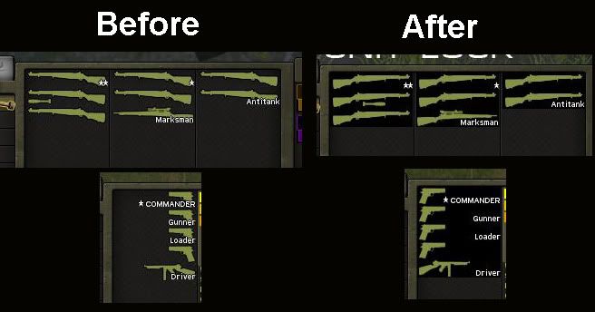
Thanks, but like I said I first saw the flipped weapons in Juju’s mod. Being that I prefer the stock weapon silhouettes to Juju’s detailed ones I made this. If you prefer detailed then I recommend using Juju’s. Either way the right facing orientation makes better use of the negative space to accommodate the type so it does not cover the graphic. I believe BF should adopt this orientation as standard since it work out better with the type. This is a very easy change to make.
Erwin, I do no think it would work with Marco’s range/caliber weapon silhouettes as is. Marco’s would have to be flipped, and the range/caliber type would have to be moved. I recommend doing a print out to have caliber/range info available, and use Juju’s or mine for a less clutter looking GUI.
 I believe this is because WEGO is RT with pauses, and is therefore a limitation of the engine - hope I'm wrong!!! Ambush is therefore needed.

Know all at a glance!
in Combat Mission Battle for Normandy
Posted
I agree. After looking at these side by side for more time I think this, the geometric detailed C2 combo, is the most effective for creating organization that can be decipher quick. The detailed C2 icons work to bring more attention to red out of C2 circle. This is my final I think for a prototype.
Nice to know you have programming knowledge Baneman. I was wondering how hard this would be to do. Am I right in that each unit in the ROSTER should have its own box, or “button” as an object to program to? My programming knowledge is limited to just web site creation.