

M1A1TC
-
Posts
1,631 -
Joined
-
Last visited
Posts posted by M1A1TC
-
-
You can also play SWAT versus insurgents (Red vs Red) Nice work. I am working on South Korean SWAT myself

-
You can also play SWAT versus insurgents (Red vs Red) Nice work. I am working on South Korean SWAT myself
-
Do they appear randomly on the battlefield like the faces?
-
Thanks MikeyD, VladTemplar on CMMODS is me
Anyway, I was thinking of Star Trek or Star Wars mod
And thats great idea about alternate Z folders!
-
"Men, is there any chance for a 1.05 for my edition?"
Yeah, a snowball's chance in hell!!! Muah ha ha ah
-
How about if you just click on a unit, it selects it. If you click and hold, after 3 seconds a menu pops up? This way the right click can be used to unselect
It can also be context sensitive. You select your unit first, then to move, click on a spot on a ground, a menu pops up (FAST,MOVE,SLOW,REVERSE,ROTATE) etc. If you place the cursor on enemy, menu pops up (attack light, heavy, supress, area fire)
-
It could be a wheel-like, as in Neverwinter Nights
[ January 25, 2008, 09:26 AM: Message edited by: M1A1TankCommander ]
-
I dont think we are debating having one or another. Seems to me like the mouse control is so inefficient that it forces players to use and learn hot keys, which not everyone likes or prefers to use.
IMO CMSF doesnt really offer a good alternative to using hot keys
-
beer in my camelbak? brilliant
Thanks -
That was not a direct quote, but my personal opinion. What I get from BFC's responses is that few things might be added in the future (mostly not the ones that are missed/requested by players) Many features should have been in from the start (adjustable waypoint for one)
I am still very upset about the UI, lack of right-click menus, etc. I feel like I have no choice but to play it using hot-keys, when I prefer it the CM1 way, when I could play the game with right hand while sipping beer with my left. Now I have to use both hands to play, while my beers sits there, lonely, getting warm
[ January 25, 2008, 07:21 AM: Message edited by: M1A1TankCommander ]
-
The pads are about 1 cm thick
The only time I got seasick was when I was a gunner. Your are shoehorned into a small corner,it's hot, the tank is rocking, and the only view you got is through the gunner's sight.
The other positions are not that bad
-
I hope BFC reads this thread and gets an idea that their UI in not user-friendly. I know that individual opinion varies, but seems like most people and reviewers find it unintuative,non-user-friendly,uncomfortable, hard-to-learn even after months after playing with it. It is just badly designed IMO.
You can continue to say "they just dont get it", and not working to fix it after months and months after release. You are just hurting your own company and sales. I am sure I am not the only one who wants you to succeed. You are one of my favorite PC game producers. I want you to keep making games. But I want them to be well designed games
-
Steve
Can you add a unique texture for each side of the vehicle? That way numbers dont appear as mirror image (as it's been since CM1)
How about more then one texture set for US uniforms? Please?
[ January 24, 2008, 04:47 PM: Message edited by: M1A1TankCommander ]
-
I also prefer to use just the mouse. Never liked using hot keys for any game in my life, and Ive been playing video games for about 23 years
-
Steve
Here is what reviewers said about the CMSF's user interface:
Eurogamer:
"...And what's happened to the interface? Where are the universal unit path and targeting lines that used to help me make sense of the mayhem? Why do I have to flip though a multi-pane panel in the corner of the screen or memorise esoteric shortcuts to dish-out orders? Where's the tutorial? Where are the tooltips that explain the plethora of new icons? Blimey, even drag-select isn't working properly..."
IGN:
"..Shock Force offers up the standard turn-based modes of the previous games, but also introduces a full real-time mode as well. It's exciting to play Combat Mission in real time but it doesn't include the standard RTS conventions, like creating hot groups, creating formations, or drag selecting mixed groups of units. As a result, you'll have to micromanage things a bit too much. On the plus side, you can issue orders in paused mode to get things the way you want them. Shock Force does away with the convenient right-click menu of previous games in the series and instead relies on a wide range of hotkeys. It's easy enough once you get used to the shortcuts, but being able to draw up an order menu right on the game map would have been much more convenient. Likewise, there are no tooltips at all in the game, which means you'll be referring back to the manual to discover just where all your commands are... "
GameSpot:
"...The manual doesn't help a great deal, either. While lots of information is stuffed into its 200-plus pages, this PDF tome is laid out like reference material geared solely to answer specific questions. And this is one game that needs a manual to take you by the hand. The interface is jammed with text that's about the same size as the fine print on auto-rental contracts, along with numerous tiny buttons bereft of context or tool tips. Hotkeys are supported, but you can't change them without editing a text file in Windows, and they annoyingly change function depending on what you're doing at the time you hit them. When you move, for example, the "I" key is "Quick," but when you're in combat "I" stands for "Target Light." Good idea, guys. Everything is so clunky and archaic, it's amazing that Battlefront doesn't include a code wheel for look-up copy protection... "
Worthplaying:
"..The user interface has also undergone a significant upgrade, both in function and appearance. In previous games, unit commands were made available by right-clicking on the map, whereas in CM:SF, they are visible on the Command Panel located at the bottom of the screen. While many of the commands would be familiar to owners of the previous games, there is a number of unique commands only found in CM:SF. These include Target Light for a reduced volume of fire on a target; Acquire, which allows infantry to pick up weapons and ammunition from certain friendly vehicles; and Administrative, which splits an infantry squad into two, or thematically into assault or anti-tank teams.
There are also some features not present in this title that were in the previous Combat Mission games. One of the most notable is the absence of being able to order armored units into a "hull-down" position, where the bulk of the vehicle is hidden from enemy view by a ridge, leaving only the turret visible. According to the team at Battlefront, allowing vehicles to go hull-down is a more complicated affair in this game than in the previous CMx1 titles, where hull-down was basically an on/off feature. In those iterations, a tank was either hull-down or it wasn't. In CM:SF, targeting is much more precise and based on the actual silhouette of a unit, and therefore a hull-down command that indicates the exact state was not considered to be absolutely necessary. This is not to say that hull-down positions aren't possible — they are — it's just that the posture isn't handled automatically by the game..."
Gameshark:
"... The user interface is even less friendly than the old one. Now standard interface tools like the right mouse button for movement or rollover tooltips for general information are eschewed in favor of a tabbed menu that assigns the same keys for different orders depending on which tab is selected. You can double-click to select similar units but not drag select for dissimilar ones..."
The Armchair Empire:
"..The game (at least in the review copy I played) is not without some flaws, none of which are deal breakers, but a few of which are annoying enough to impede play. While the new UI is well-designed, intuitive and visually rich, the camera, both mouse and keyboard controlled, feels a little unwieldy right now. Vehicle pathfinding, both enemy and friendly, is lamentably bad.."
-
Thanks John, thats my primery interest in CM games. It was a very long hard wait untill BFC finally released the modding tools
-
The downside is that the mod applies that texture to all sides of the building, right?
-
Kimerik Kukka
You have a very cool name!
-
-
Yes, they are still part of it, but they are called KATUSA now. Check out this site
http://www.usfk.mil/usfk/index.html?/gallery/photo/default.asp
Here is a site of my old unit in Korea
http://www-2id.korea.army.mil/organization/units/tf1-72/
[ January 22, 2008, 06:20 PM: Message edited by: M1A1TankCommander ]
-
Oh Cool, thanks MikeyD!!
-
Post your suggestions, ideas or opinions here on what would improve the CMSF user interface. Ill start
1. Some type of battle feedback
2. Adjustable waypoints
3. Context sensitive mouse-related squad positioning (a la Full Spectrum Warrior, Company of Heroes)
4. Smoother scrolling
5. Ability to quave (SP?) orders (a la Total Annihilation, Supreme Commander)
-
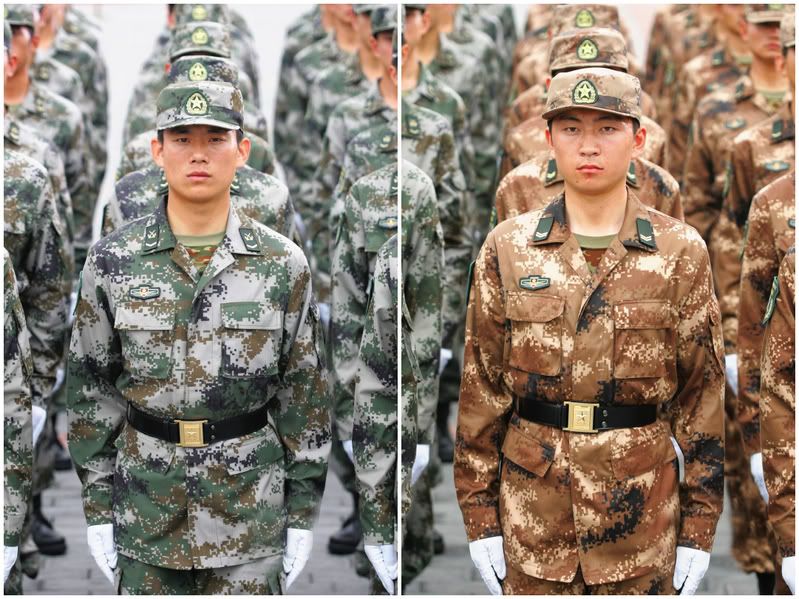
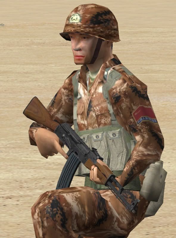
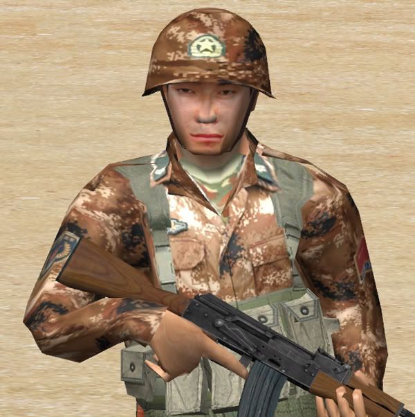
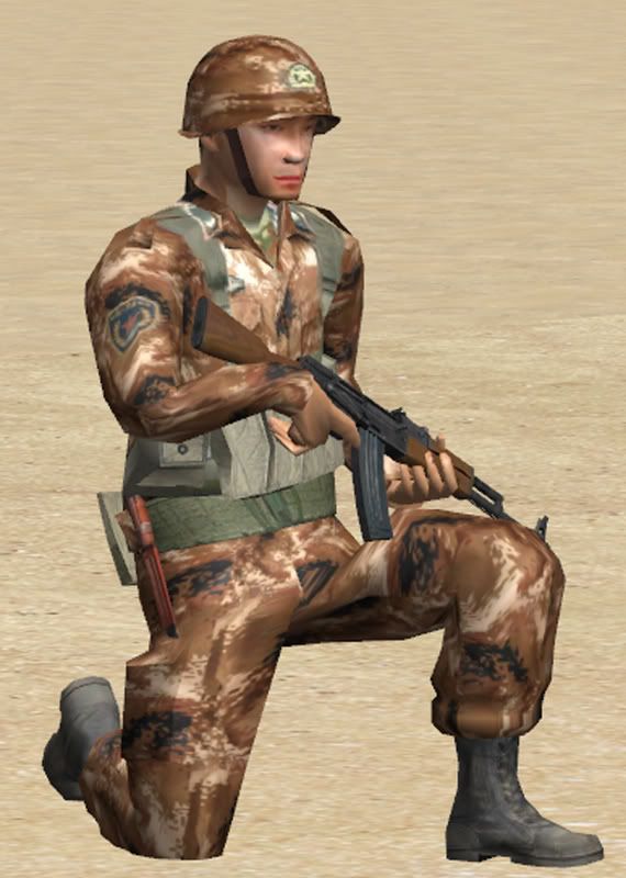
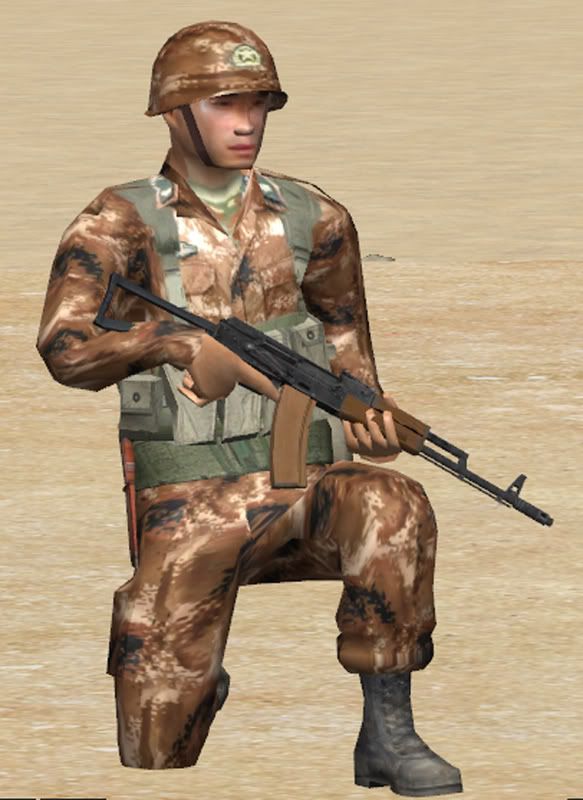
What do you mean? This is the latest 2007 PLA desert camo. The patches should be accurate as well. The faces are of 2 PLA soldiers.
-
Just played a battle between Australians and Chinese
[ January 21, 2008, 09:19 PM: Message edited by: M1A1TankCommander ]
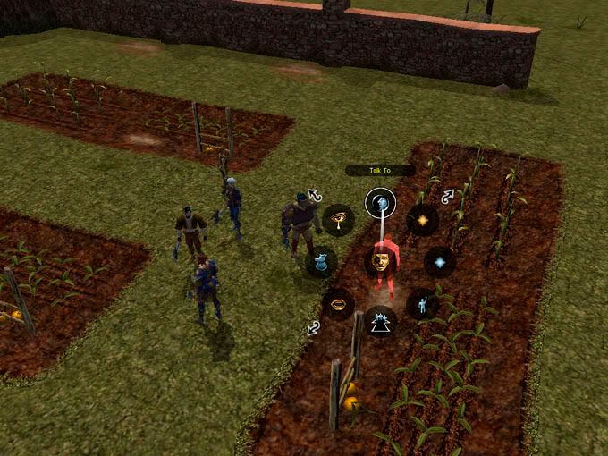
Mod SWAT for the fun...
in Combat Mission Shock Force 1
Posted
You can also play SWAT versus insurgents (Red vs Red) Nice work. I am working on South Korean SWAT myself