

Niessuh
-
Posts
46 -
Joined
-
Last visited
Posts posted by Niessuh
-
-
-
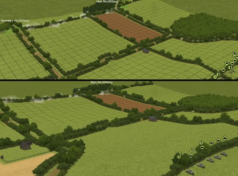
Also, soldiers in the open are ALWAYS exposed. Soldiers in walls expose only when firing/spotting
-
My fault, you all are right! I have not heard about this improvement since CMSF, but I have tested right now and works like a charm.
-
good question. At least, for future patches, I hope units will unhide when enemy enter their cover arc, "a la CMx1"
-
flammenwerfer, you have a tutorial here
http://www.battlefront.com/community/showthread.php?t=98199
Just choose one .brz file and put it into z folder
-
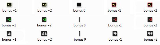
Those little boxes are attached to the number in the same graphic, so it does not have extra meaning. It's red for negative values, green for positive and grey for zero. A comparative between original numbers, mod numbers and thumbs:
-
Yes, buttons could be a little small, but this is an idea based on current space restrictions. There are a lot of alternatives, i.e. buttons can be done squared and groups could be put on rows instead of columns. Void space because of non usable orders can be used for the actives ones. Columns can "invade" a little bit of batlle bottom, or, as LJFHutch said, GUI space could be made larger

-
Well, It is a great pleasure to see consensus at this forum
Some other interface suggestions thread and a mod:
http://www.battlefront.com/community/showthread.php?t=97447
http://www.battlefront.com/community/showthread.php?t=97781
Will try to gather ideas around unit info panel, main point is the same: kill those tabs!
put tab information into unused space from non-informative places (silhouettes, portraits) and concentrate similar info in the same place.
-
that is right, changes are "I am used to"-compatible

-
Some ideas about command panel reform, now that Battlefront has time to improve the interface and a "mayor overhaul" is on their way -huzzah!-
Command panel is probably the most delicate part of GUI, as everything it contains is highly interactive, opposed to the just informative mission for unit/team/details panel. Also, order system is a core functionality. As you can see on this same forum, It is probably one of the harder learning curves. Of course, It can't lose their richness but it can be presented with less use complexity.
Some constructive criticism first. This is a command panel in RT or at order phase (if playing turns):
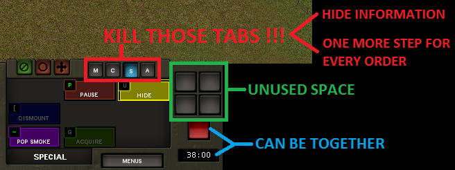
Main point of interest is those tabs. First, they hide info. Is my unit deployed? hidden? can they run? you must switch tabs to know all of this info. Second you need to select correct tab if you are using panel to give orders. It's one more click on an already complex procedure. Also, they occupy space.
Turn controls occupy unused space also. They can appear only when watching turns, freeing space meanwhile.
Finally, red button can be merged with timer, they share meaning. This way digits can be seen bigger and with a very proper red background.
This way you can have a solution with all orders at once glance even keeping the same space restrictions. An example with orders buttons reduced half in height:
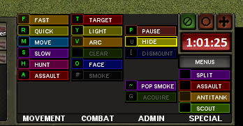
As you can see I maintain order groups (now columns), even left blank space for non applicable orders to current unit still. Same nine spaces for every group, except special orders wich has its four needed places. More room can be achieved. So, even in the same space, you can eliminate tabs and have full information on a faster interface.
Some similar reform can be made with unit info tabs (ammo/defences/damage - unit/formation), but this another case study...
Now some words about command panel on turn mode, when visualizing
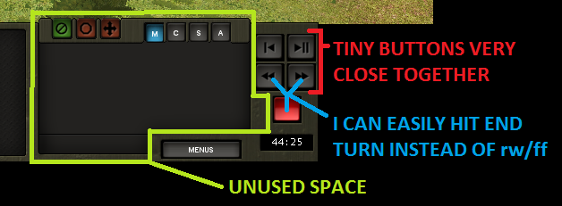
See all this unused space? and, at the same time tiny little buttons for time control very close together. Raise hands those who has finished turn instead of rewind or any other wrong combination. There are a lot of space available on this mode, so you can have BIG buttons, like this:
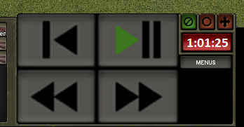
YEEHAW! those buttons are so huge I can pulse it without staring out of the action! no more frustrating mistakes.
-
you can use Rezplode (at the Mod Tools folder) to unzip the .brz file, put "suppression meter.bmp" out and then move the rest to RezPack, zipping again.
I am actually at work so I can't do it

-
I'm sorry to say we cannot mod texts fields, these are hardcoded. Fonts are available, but the only change we could make is changing font type and colour for the whole interface, I guess
-
-
Also, these backgrounds blinks! you won't miss a failed morale squad again
-
I was going to write ideas and suggestions about unit info optimization in a similar way we did at a previous thread about soldiers info panel:
http://www.battlefront.com/community/showthread.php?t=97447
But then I figured out how to make it into a mod.
So, well, enjoy it,
it will be downloable soon.
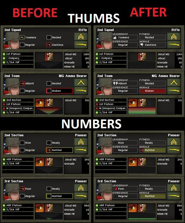
This mod gives a background to the unit info attributes by filing the blank spaces between them, describing and grouping every attribute.
Include a full coloured suppresionmeter based on Marco Bergman work.
Two bonus versions to choose, thumbs or numbers.
Spanish texts versions also included.
Hope you like it.
-
add me to the suggestion (not complain) about border camera freedom
Some other ideas to improve the interface:
-
This could be a good solution too, I hope someone at battlefront takes care about optimizing and reorganizing the interface, there is a lot of little changes that could be made to improve tremendously the interface. Learning to use the GUI is probably the main difficulty of CMBN for a new come player
-
As far as this illiminating the need for the soldier stat text altogether I disagree as the text shows more than just casualty information. It also shows things as status of engagment.
I suggest including this same texts into the unit info panel, see second screenshot
-
None of those suggestions are moddable, unfortunately. Any change in UI coding rests with BFC, and I doubt you'll see anything until the Bulge title.
Marco is right, I photoshopped this as a suggestion to future patches or releases. I also have to say I quit your wonderful mod to take the screenshot
What unit face mod (upper left of GUI) are you using ?Mord's CMBN Unit Portraits Mega Pack, flags + alternative:
http://www.battlefront.com/index.php?option=com_remository&Itemid=314&func=fileinfo&id=1156
-
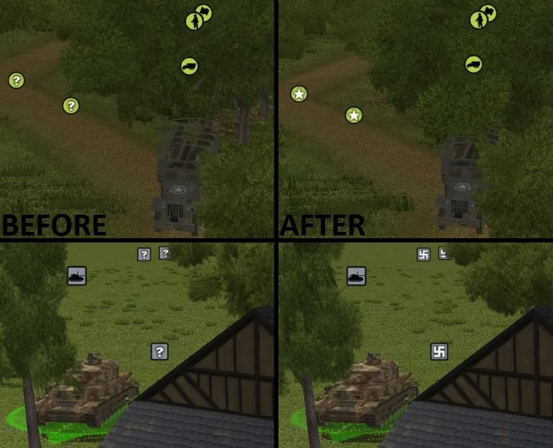
Good morning Battlefronters. Reading previous debate about GUI reorganization and optimization I want to suggest an idea about how soldier info could be better displayed.
When you actually want to now about some soldier you need to look three separate places: battle, GUI and green letters. Also panel info do not show dead and casualty soldiers.
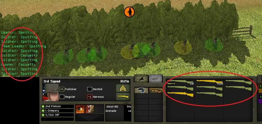
The idea is pretty simple: put all of this info together, like this:
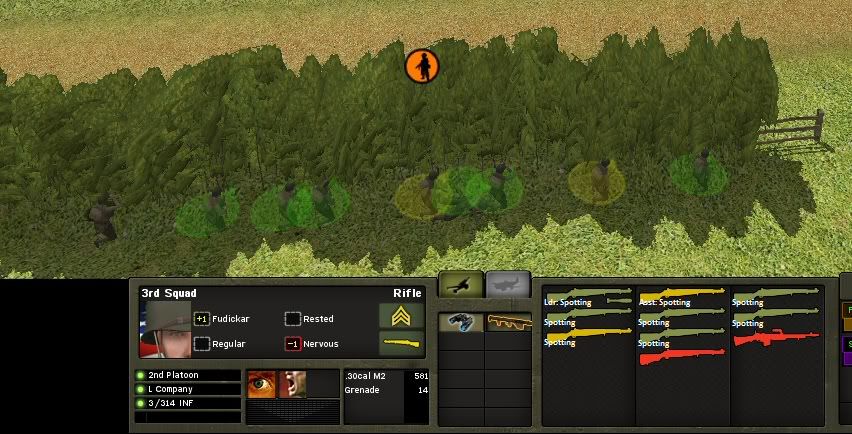
No more need for those green data occupying battle corner during gameplay.
-
Stahlhelm included? what do you paid to battlefront?
-
Thanks, fortunately far view textures are proportional to action spots size, which is not the case for detailed close view textures
-
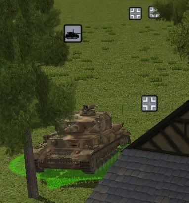
Every tile is FOUR action spots, 16 X 16 meters
-
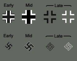
v1.1 uploaded, alternative version with Late Balkenkreuz instead of Swastika
http://www.battlefront.com/index.php?option=com_remository&Itemid=314&func=fileinfo&id=1154


Upgrades Q&A
in Combat Mission Fortress Italy
Posted
All of this are complete products. You are offering fifteen minutes of a movie, a dish for the lunch or sugar for the coffee.
Money is not the problem. Problem is a constant request for upgrades. If continuous release of free patches is an annoying habit, paid patching is a deception. Upgrades, modules, packs...create the euphemisms you prefer.
A lot of your audience is (still) not fanatical. Outside of these forums people react diferently to your business desitions:
http://www.rockpapershotgun.com/2012/07/06/the-sicilian-defence-battlefront-talk-plans-prices-pixies/#comments