

Kal_PdL
-
Posts
6 -
Joined
-
Last visited
Posts posted by Kal_PdL
-
-
Thanks for sharing. It is a nice scenario. It will be very interesting to give it a go against a human attacker.
ACHTUNG SPOILERS AHEAD!!!!!!
+
+
+
+
+
+
+
+
+
+
+
+
+
As you see I managed to get the mission accomplished with only nine casualties. Perhaps too much info is given away on the designer notes. I set up an ambush for the expected Shermans and the poor tankers never got a chance to survive against the german wild cats.
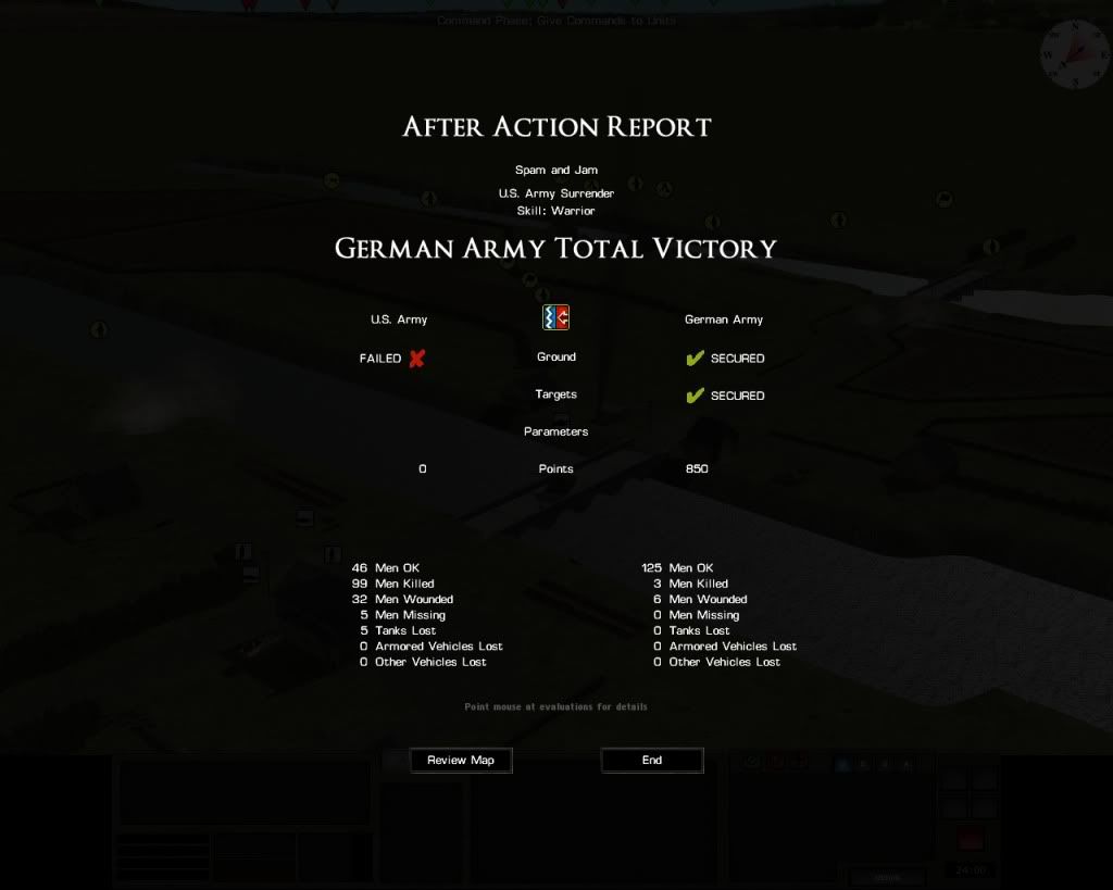
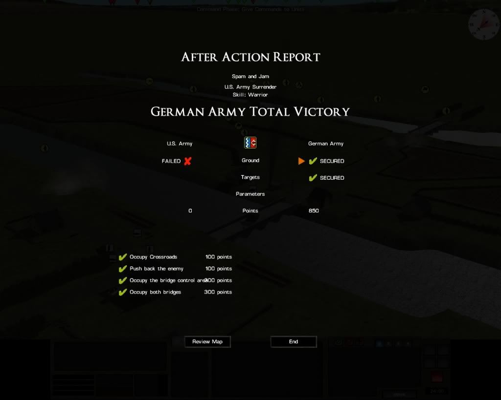
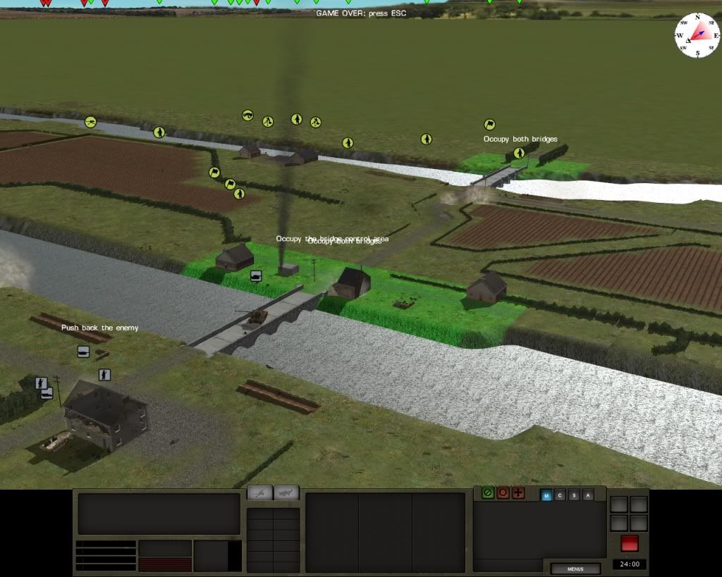
As shown on the next images the US defenders surrendered before I could get to the second bridge. That Panther on the bridge is my most avanced unit.
-
Some ideas about command panel reform, now that Battlefront has time to improve the interface and a "mayor overhaul" is on their way -huzzah!-
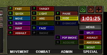
Command panel is probably the most delicate part of GUI, as everything it contains is highly interactive, opposed to the just informative mission for unit/team/details panel. Also, order system is a core functionality. As you can see on this same forum, It is probably one of the harder learning curves. Of course, It can't lose their richness but it can be presented with less use complexity.
Some constructive criticism first. This is a command panel in RT or at order phase (if playing turns):
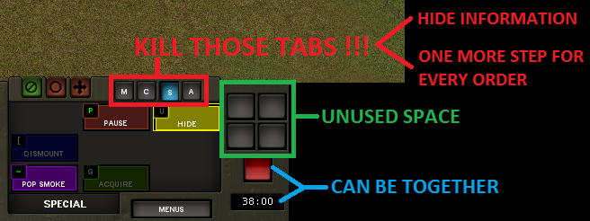
Main point of interest is those tabs. First, they hide info. Is my unit deployed? hidden? can they run? you must switch tabs to know all of this info. Second you need to select correct tab if you are using panel to give orders. It's one more click on an already complex procedure. Also, they occupy space.
Turn controls occupy unused space also. They can appear only when watching turns, freeing space meanwhile.
Finally, red button can be merged with timer, they share meaning. This way digits can be seen bigger and with a very proper red background.
This way you can have a solution with all orders at once glance even keeping the same space restrictions. An example with orders buttons reduced half in height:
As you can see I maintain order groups (now columns), even left blank space for non applicable orders to current unit still. Same nine spaces for every group, except special orders wich has its four needed places. More room can be achieved. So, even in the same space, you can eliminate tabs and have full information on a faster interface.
Some similar reform can be made with unit info tabs (ammo/defences/damage - unit/formation), but this another case study...
Now some words about command panel on turn mode, when visualizing
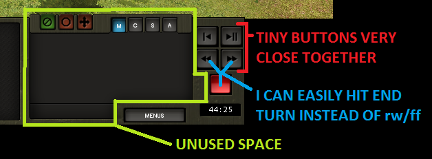
See all this unused space? and, at the same time tiny little buttons for time control very close together. Raise hands those who has finished turn instead of rewind or any other wrong combination. There are a lot of space available on this mode, so you can have BIG buttons, like this:
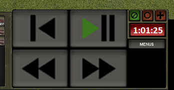
YEEHAW! those buttons are so huge I can pulse it without staring out of the action! no more frustrating mistakes.
Niessuh, that's an interesting bunch of suggestions. I'd love to see them implemented in the game.
Perhaps BFC could give us their opinion about your ideas to improve this GREAT GAME.
-
Thanks for sharing your findings.
-
Is that the helmet you use while playing CM at home???? Looks pretty weary.

Nice pic, my friend.
-
It's an excellent idea, Niessuh.

Free Kindle ebook - Armored Bears: Vol. 2
in Combat Mission Battle for Normandy
Posted
Thank You Fenris.